Case study 
MH Life Balance
MH Life Balance (Margaret Hunt) is a Health Kinesiologist, House Whisperer and Digital Mapping Consultant based in the UK.
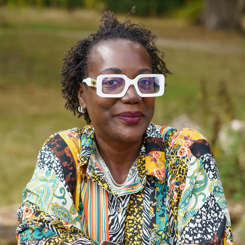
Margaret was referred to us by a long-standing client, as she wanted to start a new venture using her unique set of skills. She wanted help to create a strong brand which represented her and was unique and easily distinguishable from her competitors. From there we worked with Margaret to design and develop a website, capture amazing portrait photography and to work on a deck of cards.
mhlifebalance.co.uk
– Website Design & Development
– Hosting
– Branding
– Photography
– Graphic Design
Customer since 2022

I had the greatest pleasure of working with Holler and will continue too.
I had no idea what I wanted, but knew that I needed a website, we had a chat and they clearly saw something in what I was saying and produced my beautiful website. I was bowled over and thought, yes this is what I wanted but didn’t know how to explain it. They sorted out my branding, Google Business, Business cards, my PDF documents, my photos and by beautiful deck of Healing Cards (and I have more that I need doing). I am over the moon with everything that they have done for me. I feel professional, I feel everything is me.
If you are not sure what you want, what you need, what the next step is, Holler are your people. You will not be disappointed, trust me, just do it. It is by far one of the best things that I have done for my business.
Margaret Hunt
Owner, MH Life Balance

Web Services
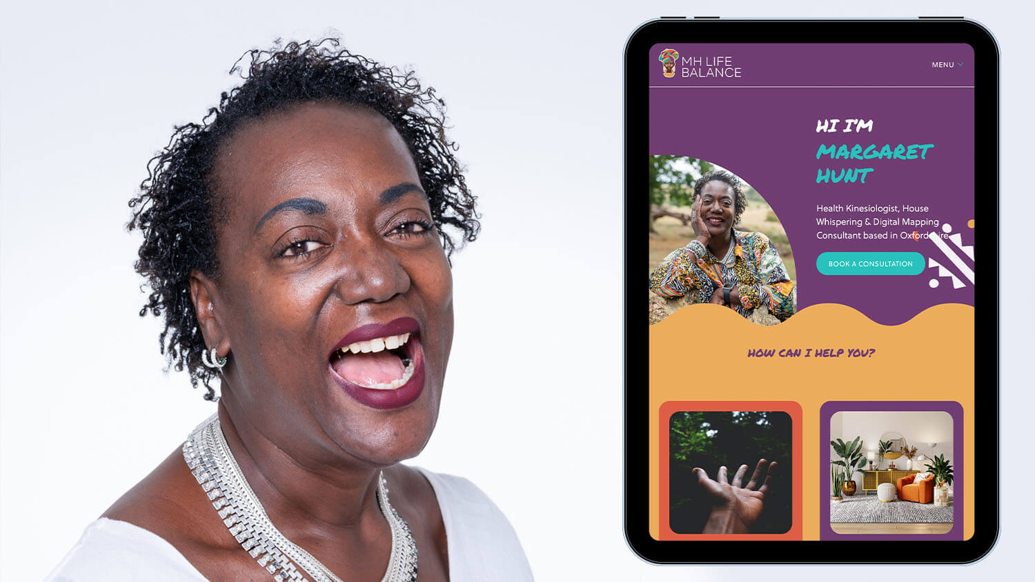
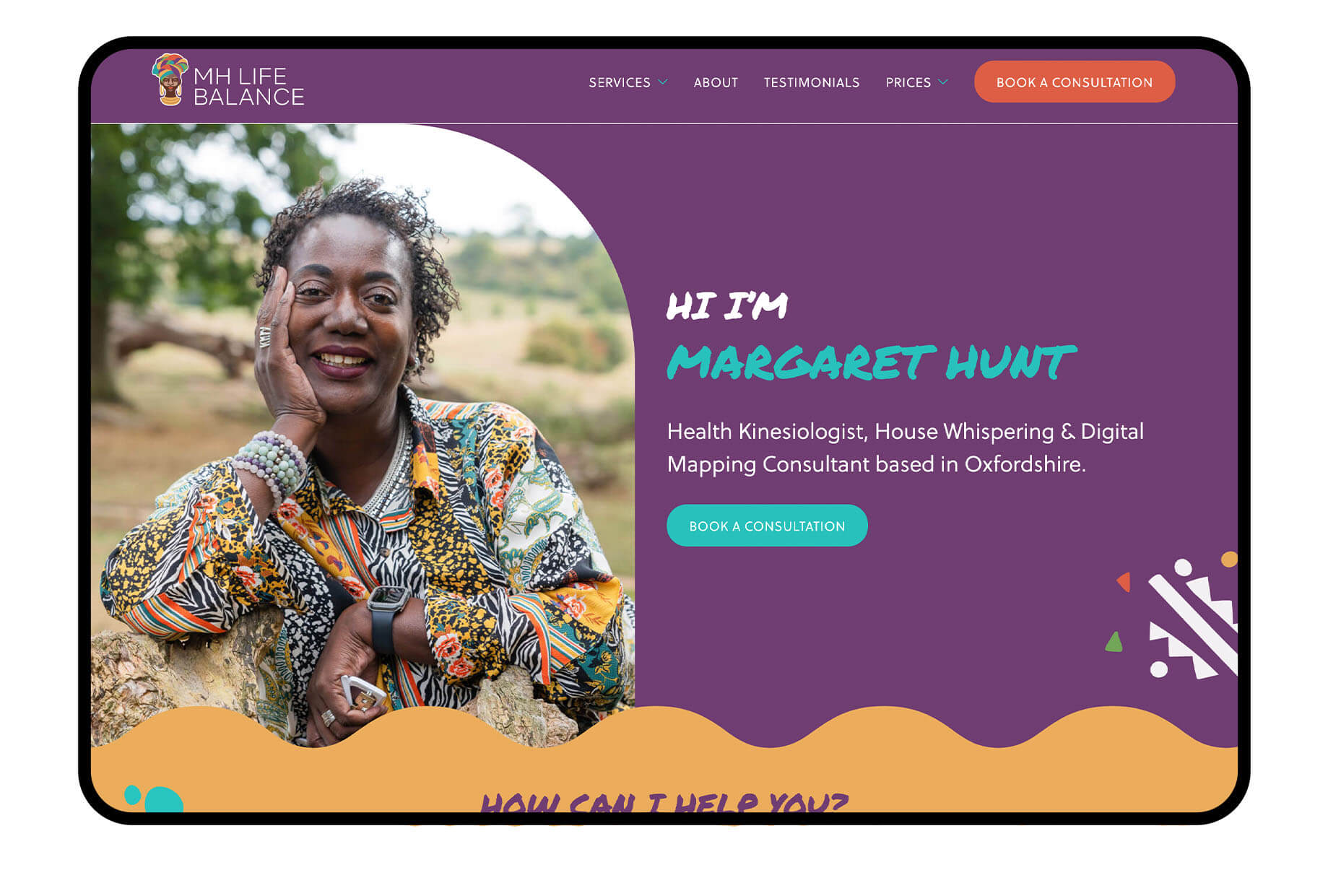
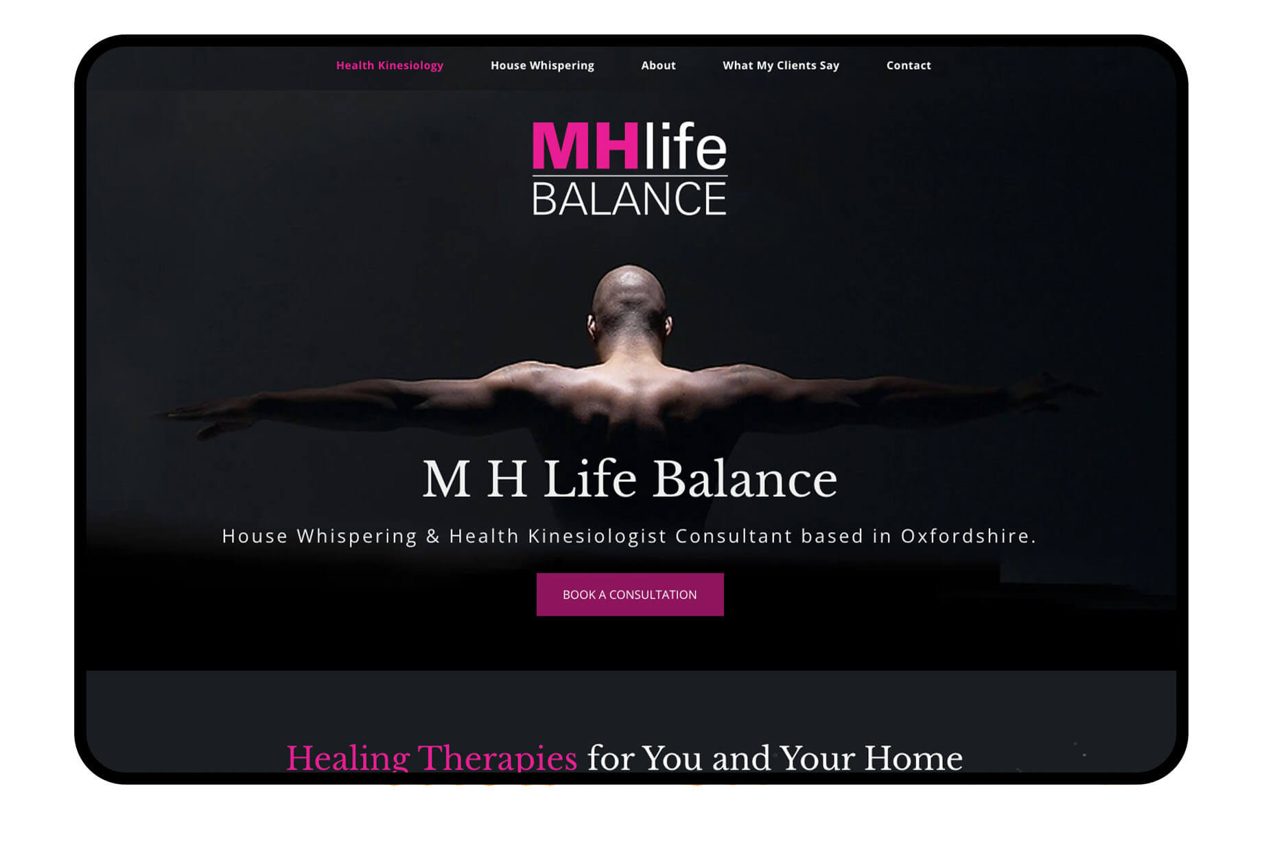
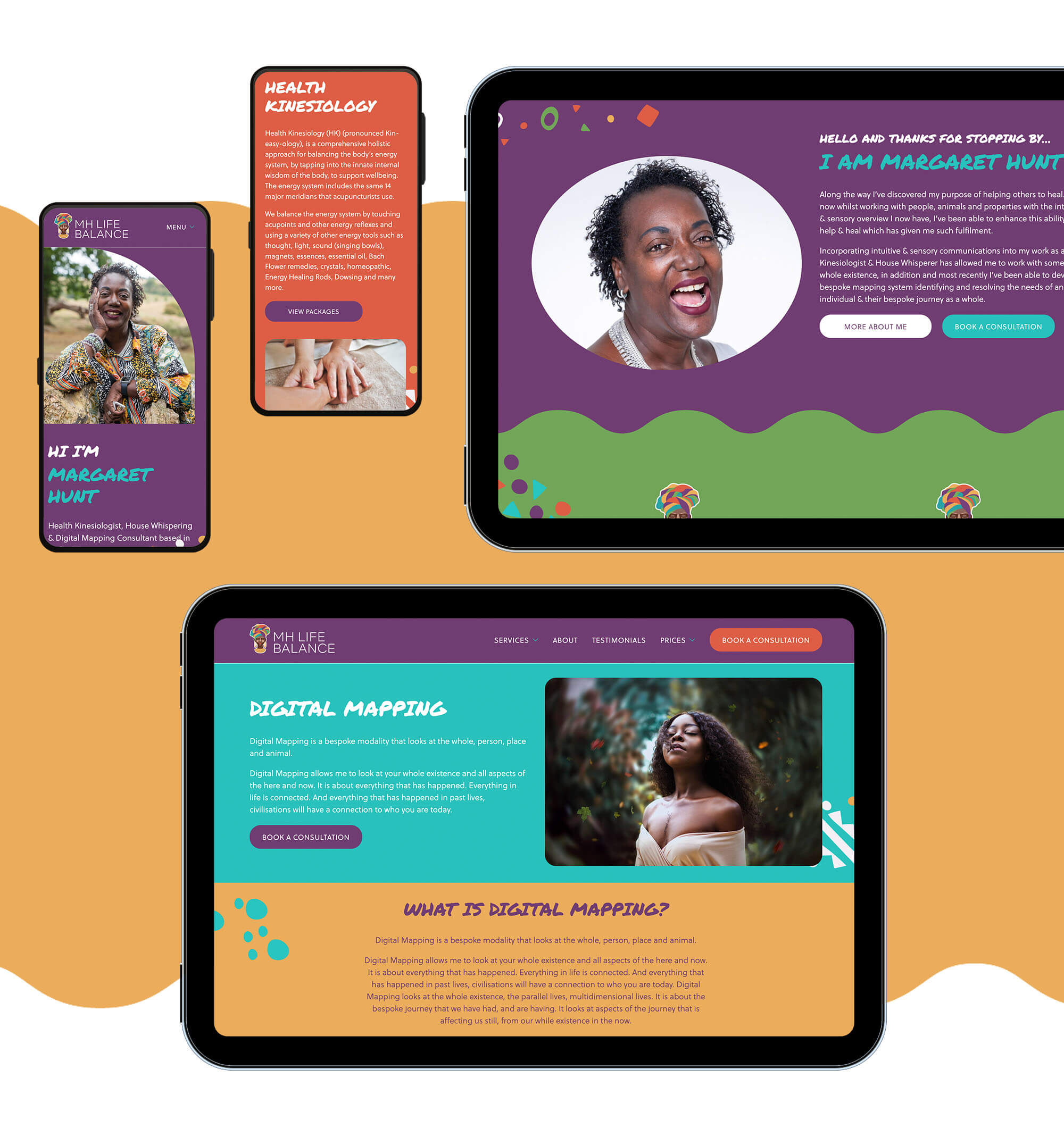
Margaret’s previous websites didn’t offer her audience an insight into who she really is, and what her business offers. After going through 5 previous website experiences, we wanted to provide her with a website that truly represented her services whilst keeping a strong brand from the branding exercise we did.
Website Design
The design approach to the new website relied heavily on MH Life Balance’s new logo with its strong visuals. The website was designed to be inviting and fun whilst being informative and easy to navigate for her audience. Unlike a lot of our previous websites, this design was a challenge as we worked with a bold colour palette with little use of white. We also complimented the website design with illustrations to enhance the brand further and tie into her ethnic roots.
Website Development
Visually interesting sites often come with an overhead: more graphics which can impact load speeds. To avoid this, we used a combination of methods; one of which involved clipping the curved wave graphic to its smallest repeatable size, exporting it as an SVG (which can be infinitely scaled without blurring) then optimising that image data (which results in 248 characters). Instead requesting the image directly, because the data is so small, we can embed it directly in the code that styles the site, which has already been loaded. Then we just repeat and colour the wave section as required in each and every block, saving hundreds of kbs compared with other methods. (Still awake?)

Creative Services
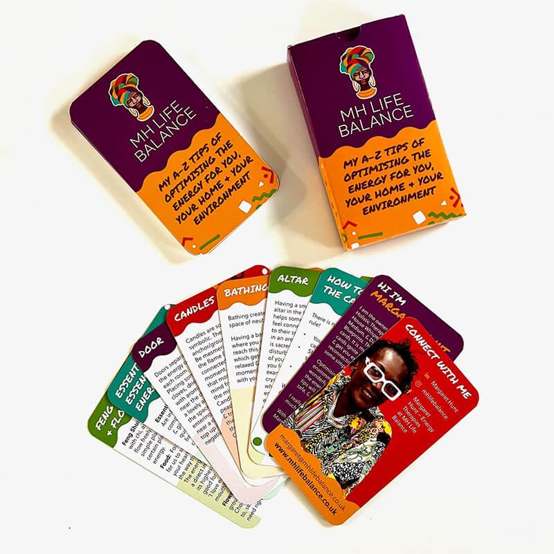
As well as the website, we worked alongside Margaret to rebrand her business as the previous logo and overall look and feel didn’t fit her bubbly and friendly personality. We have also worked on different design elements such as social media posts and a deck of cards as well as photography.
Branding
The branding brief from Margaret catered to her ethnic background and personality. It was important to her that we captured the right imagery for the logo as previously her brand didn’t reflect her or her company’s ethos. After detailed discussions with Margaret on the styling, colours and the overall look and feel, we presented the logo and colour palette. We chose bright colours with a mixture of warm and cool tones to complement one another, the colours were used in combination with neutral browns to offset the main headpiece in the logo’s imagery. The font chosen provides a sleek and professional look and feel to the brand.
Graphic Design
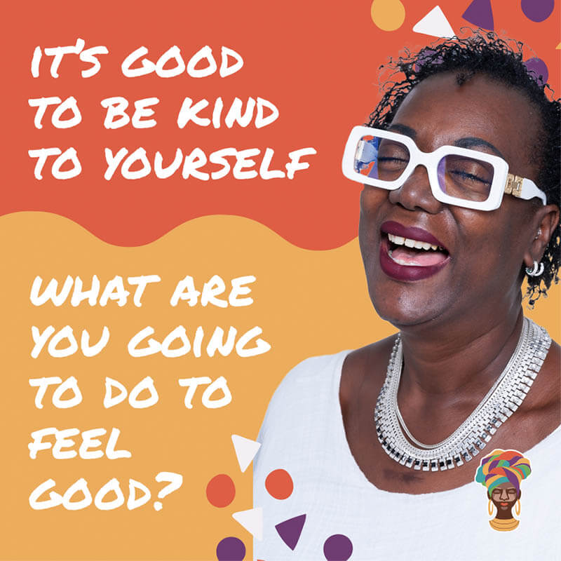
To strengthen the MH Life Balance brand, we have worked with Margaret to create internal documentation for her to use with her clients. The new documents reinforce the MH Life Balance brand whilst providing a sophisticated and professional overall look and feel. We created several social media posts for her to use across different platforms. We combined the photography and illustrations used on the website to ensure the brand is easily recognisable. We have also worked closely with Margaret to create a unique and on-brand set of ‘Energy Tip’ cards for her clients, all the cards were designed to work alone as well as part of the deck.
Looking for something else?
Check out our other services


Let’s get creative
If you’d like to know more about our services and how we can help grow your business, get in touch with a member of our team today