Case study 
The Pumpkin Patch at Bewholme
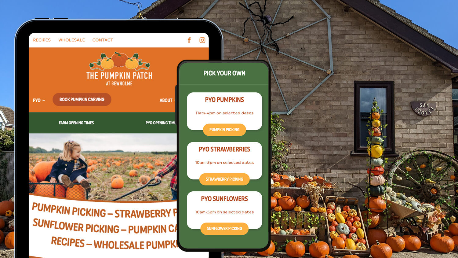
The Pumpkin Patch at Bewholme is a family run farm that, among other things, focuses on growing pumpkins and offers a ‘Pick Your Own’ service during the run up to Halloween.
Initially we were asked to host their old website, but when it became clear that it was in need of a new look and added functionality, they asked us to redesign it. We started by updating the branding, and they decided to change the name slightly to better represent who and where they are. The website now has a fresh new look, is much easier for users to navigate, and can be updated quickly as the seasons change.
thepumpkinpatchatbewholme.co.uk
– Website Design & Development
– Branding
– Hosting

Web Services
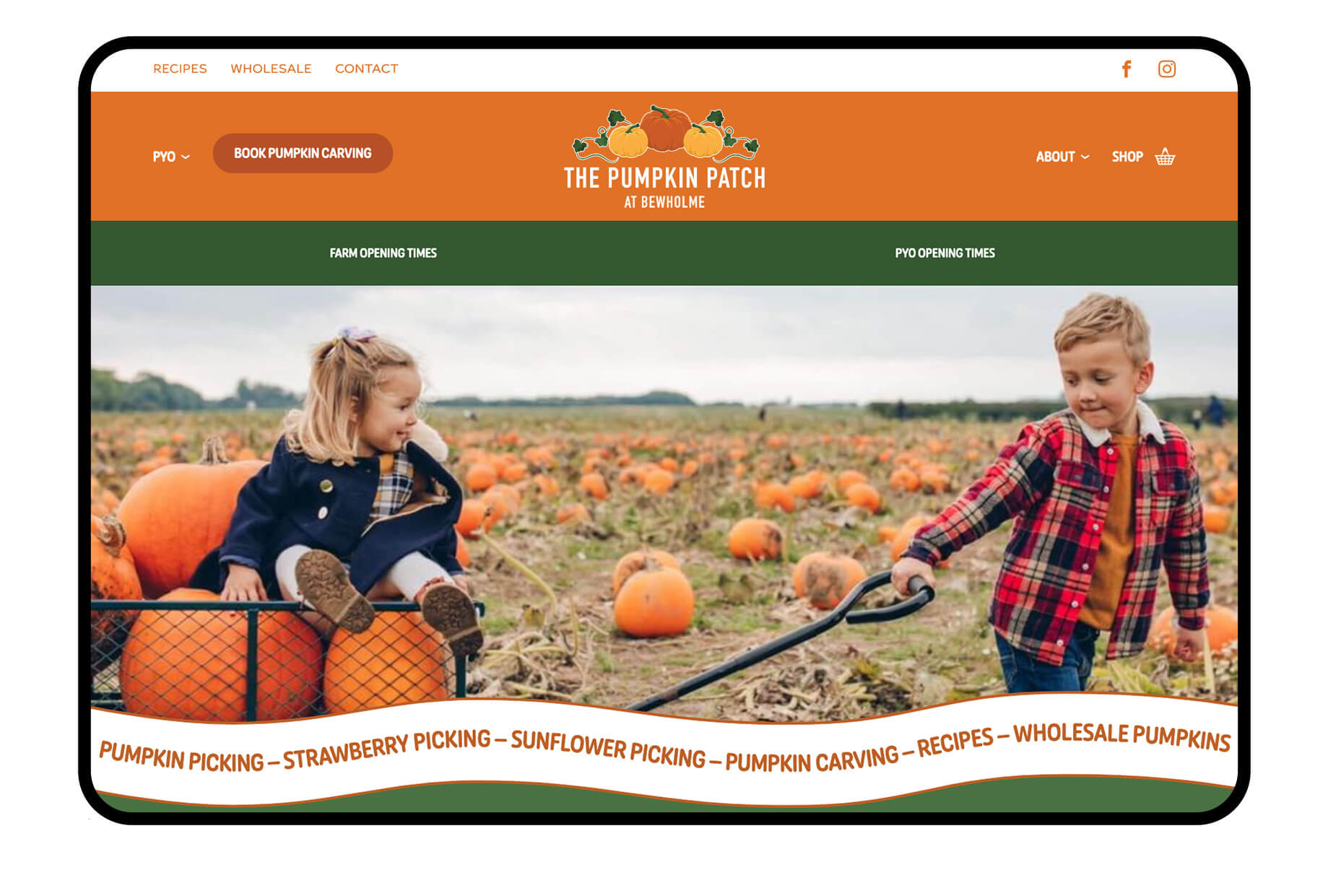
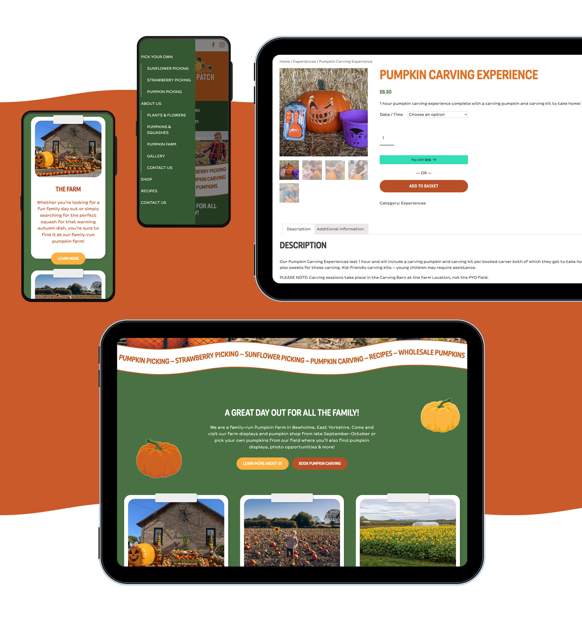
The owners of The Pumpkin Patch wanted their site to be easy to navigate, making it clear to customers the difference between the farm and the field, as well as informing them of when the field is open for PYO, and letting them book pumpkin carving experiences.
Website Design
For their new website, the main objective was to give it a new look and bring it up to date. They wanted something fun and lighthearted, using autumnal colours. Since the main demographic for the business is children, or parents of children, we wanted to make the site simple yet fun, but not too childish, which is why we decided to use organic shapes and rounded corners. We used the singular pumpkins from the logo as illustrations, using the white outline to give them a sticker-like look, keeping in theme with the tape we used on some of the other sections.
Website Development
This site uses curves, waves and skeuomorphic elements, which can be trickier to bring to life whilst maintaining excellent performance and accessibility. For instance showing text along a curved line is not natively supported in the browser, so it could be tempting to flatten the text into an image. However search engines and screen readers cannot read this text, characters cannot contain links, be copied/pasted or easily updated by the client within the CMS. To solve these problems we used SVGs to performantly integrate the curves and waves. A little extra work, but the benefits speak for themselves.

Creative Services
Like their website, The Pumpkin Patch branding needed a refresh. This was a good opportunity for us to give them a shiny new look to impress both old and new customers, and let everyone know they’re a modern business who keep their information up to date.
Branding
They wanted to stick with using a pumpkin icon similar to their old logo, but it needed re-imagining with a fun, fresh feel. We limited the colour palette to three colours to keep it clean and simple, but used a range of shades to give the illustrations a bit more depth; we also included the vines/leaves at the clients request. When choosing the colours, not only did we want colours that perfectly encapsulated autumn and pumpkin picking, but we needed to make sure they would work well on the website, this is why we went with slightly earthy tones, as opposed to bright colours that would be overwhelming on a website.

Looking for something else?
Check out our other services


Let’s get creative
If you’d like to know more about our services and how we can help grow your business, get in touch with a member of our team today