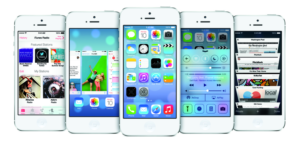
Apple officially announced iOS7 yesterday, the latest version of it’s iOS operating system, claiming that it is the “biggest change” since the release of the iPhone. The re-designed user interface appears more stripped back and refined, with bold and colourful statement icons and and new fonts. Whether you like the new icon design or don’t, personally I think it works exceptionally well as it makes the interface of the iPhone itself look larger. The tones and simple graphical images for each icon allows iOS 7 to present a more sophisticated yet simple user experience, others may disagree, claiming them to be “messy” and “a step back for Apple”.
Looking at the new design for iOS 7, I have noticed that their approach to in-app navigation has changed, the traditional navigation buttons are now less intrusive and more intuitive, which I personally think looks beautifully clean and subtle. Combined with the brilliant use of white space Apple have really out done themselves by creating a simple yet effective design for all iOS users.
However, until iOS 7 is released we cannot justify our opinions on the style and operating system without actually using it. I for one hope that it succeeds, allowing Apple users to get the full potential out of their products. On the other hand, if it proves to be unsuccessful, history may show that Apple failed to capitalise on the success of the original design.
– Sophie

