From the dawn of the one page checkout, to Amazon’s 1-Click, to payment buttons and gateways offering integrations like Stripe’s Link, it would seem that successful ecommerce trends quicker. The quicker a customer can complete the transaction, the more likely there is to be a transaction at all.
However, as Amazon are well aware, a frictionless checkout is primarily an experience favoured by western markets, and not necessarily a common user experience preference shared across the world. Amazon have fine tuned additional friction into their process for eastern markets as studies have shown that people from high context cultures prefer more information up front, even at the cost of expediency, in order to complete checkout. (You can learn more about the reasons why in this 11m high level video.)
Let’s discuss how friction can impact your sales, both positively and negatively.
High friction is never a good thing
At one end of the spectrum, configurable products or services might be fronted by a simple contact form. Interestingly, too few, or too many questions can both increase friction. Prompting the user with only a blank text area to explain their requirements could force users to reverse quickly out of your site. So too could a form requiring every minutiae to be detailed before allowing a message to be sent.
At the other end of the spectrum, if the product or service is purchasable, convoluting the product, basket or checkout pages can force checkout abandonment. Perhaps your product is perfect, your service is exactly the solution required, but the website makes it too hard to connect you and customer. Does your basket page contain so many cross-sells the checkout button is visually lost? Do pop ups about coupons, signing in, newsletters make it it difficult to use? Does the checkout form ask for seemingly unrelated personal information?
Zero friction can be good thing
For some products and users, immediate payment buttons are what they perceive to be extremely convenient. Perhaps the product is low cost, digital, and uncomplicated. Perhaps the target market is time poor, and the service is self explanatory. It is fair to say though, that most people want a little more information before handing over their payment credentials. How much is delivery? What is the returns policy? Where is the company based? What are the reviews like? Is there a cheaper alternative elsewhere?
Empower and comfort users with ‘considered friction’
Undertaking a simple exercise on your key products and services, whether purchasable online or not, can help you reach a friction equilibrium. Get in touch with us today for a free ‘Checkout User Experience Review’. The exercise has two objectives:
- Ensure the user has the right amount of information they need to feel confident about the purchase, but not too much information to delay or discourage checkout completion. For example: a customer may need to know that if they are not happy with the product, they can get a refund. Most customers do not need to know the exact terms, however generous, in order to feel secure.
- Ensure you have just the right amount of information to proceed effectively with your processes, but not too much information that would have potentially transpired later in the customer/client experience. For example: you sell caps that are embroidered with a custom logo, with a MoQ of 1000. You force the user to upload an SVG file in order to add the item to basket as people were uploading poor quality JPGs. Question: Do you need the logo file at the point of purchase? Or can you get that later?
Most content management systems will allow content or settings changes to the ecommerce platform without the need for coding knowledge. Below are 6 ways you can increase confidence in your store and decrease drop offs for your store today.
3 ways you can remove friction at checkout today
- Postpone difficult decisions where possible: Remove loaded questions from your product or checkout forms. If the decision can be made later, add an additional option like: ‘Let’s discuss later…’ to complex questions.
- Checkout input: Remove any field that is purely for the benefit of your internal processes, remove that burden from the customer.
- Delivery options: Most stores do not require table rate shipping. Table rates add complexity for you, and the customer, with the vast majority of options never selected.
3 ways you can create ‘considered friction’ at checkout today
- Cart notices: Adding extra information/context on the basket pages to inform the customer of what they need to do to get free shipping increases friction, but can also increase order size. (Calculations may require help an ecommerce developer).
- Small print snippets: Add key return/terms/review information to cart or checkout with links to the full information page. For example, most customers will not click through to read the returns policy, but knowing that returns are accepted, will give them the comfort needed to complete the transaction.
- Basket cross sells: Selectively pairing items in the cart with related products gives the customer more to think about, increasing friction. But the benefits for both parties are apparent.
Ways Holler Marketing can help hone your ecommerce friction
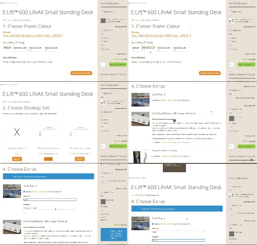
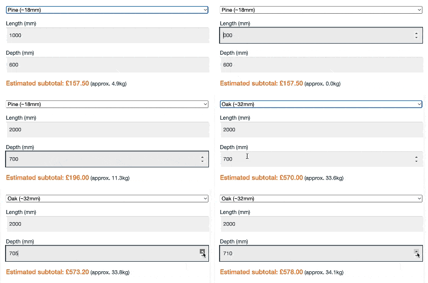
Allowing users to configure complex products themselves can empower them to purchase. This could involve step by step configurators, building up the product with options, transparently updating a dynamic price based on their inputs. Here are some recent examples.
Holler Marketing can also conduct free ‘Checkout User Experience Review’ on your current checkout experience, and offer specific and tailored suggestions and solutions to help you and your users reach ‘considered friction’.


