First point of contact
The home page of your website is usually a visitors first contact with your business, so needs to be impressive and easy to use. Not an easy task! We’re all put off by adverts, pop-ups and information overload when we visit a website so it’s important to keep it simple. The right combination of text and images is key here, too much text will put people off, too little and people will be left wondering what your business is all about. Images need to be well taken, not generic downloads, and relevant to the content. If you sell cameras then it stands to reason that you have some beautifully taken photos of cameras. If you want to attract people to your location add a picture of your shop-front to aid visual representation. This makes it easier for people to recognise your shop when they first visit.
Keep it simple
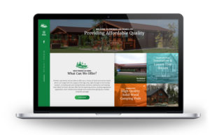
The home page has several jobs to do, apart from the obvious promotional aspect. It needs to draw people in and make them want to explore further, and it also needs to be informative. It’s frustrating to have to go around the houses to find a phone number, that’s all some people want, so make sure it’s right there on page 1. This one we designed for Premier Log Homes is a good example of a simple layout that looks great and works well.
If you sell physical items, promote some of your top sellers, with links to their full listings. Add a few special offers that you change regularly. This is great for SEO as it shows Google that your site is current. Sliders are a good way to keep things updated, just don’t put too much text, then have them rotating so quickly that there’s no time to read it all. Snippets of information, with a link to the page, is fine. Again, change them often to keep things fresh.
For businesses who offer services rather than goods just give a synopsis of what your services are and link to the relevant pages.
Make it eye-catching
The content of the homepage must be eye-catching and well written with no grammar or spelling mistakes. If you’re unsure of anything, get it checked by a copywriter.
Finally, testimonials on the homepage sent a great message to people – “We’re good at what we do/sell and are proud of it”. Again, snippets are fine, with links to the testimonial page.
Homepage checklist
Our checklist will help you to make your homepage well optimised. Keep it simple, can visitors tell what your business is straight away?
- Use great images that promote your business
- Text needs to be around the 300-word mark
- Are your contact details easy to find?
- Do you update it regularly?
- Have you spellchecked?
- Have you got some great testimonials on there?
Once you’ve got all these elements in place, you’ll have a homepage to be proud of and that will work.


